MQDH and Meta Quest Link now have the same icon and that's terrible
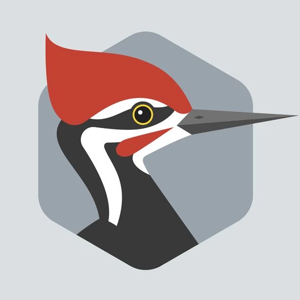
As of a recent Link update, it now shares the exact same icon (and first two words) with MQDH. As one of your developers, this is terrible. This is how it now looks on the taskbar.
It's a very tiny thing, but it's also the tiniest thing for you to NOT do that. It just adds a constant annoyance for your devs that should have been totally avoidable. I get that this is probably tied up with Branding and people who do not live in the same reality as developers, but just do SOMETHING to differentiate them.
I'll also note that when you bring up Link, you still get the blue meta logo, so use the blue one for the taskbar, maybe?