

MetaStoreHelp
Community Manager
April 7, 2026

Navigator Now Rolling Out to All Quest Users
  • April 7, 2026
  • 309 replies
  • 13718 views

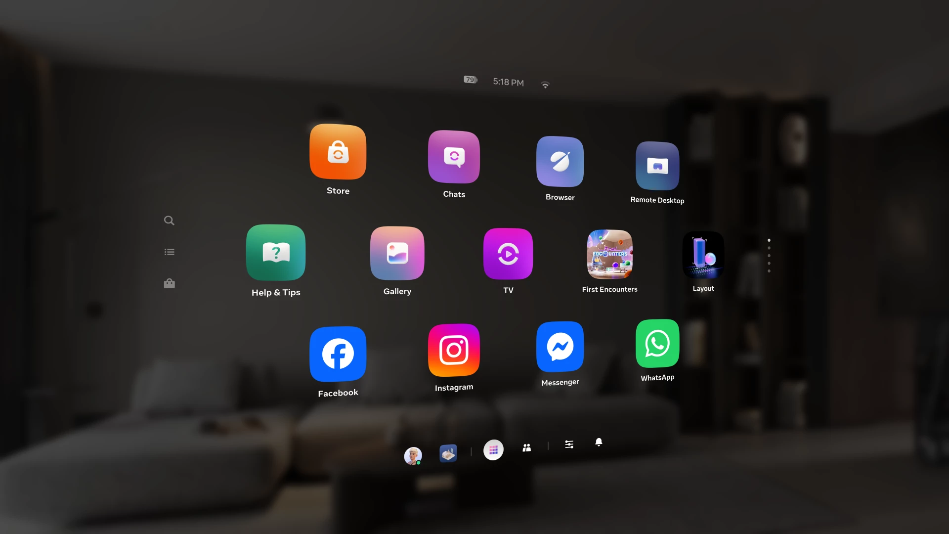
Over the past year, we've been building Navigator — a redesigned interface that brings your apps, people, and system controls together in one place. Since we first introduced Navigator, we've heard your feedback and continued to refine the experience. Navigator is now rolling out to all Meta Quest users.

Navigator is now the default navigation experience, replacing the previous Universal Menu to give you a faster, more streamlined way to access everything on your Quest. 

  • One Unified Interface: Press the Meta button to open Navigator. Your apps, settings, and people are all accessible from one place. 
  • Guided Walkthrough: The first time Navigator appears, an in-headset walkthrough will guide you through the new experience so you can get up to speed quickly.

Thank you to those of you who provided your valuable input as we worked to get Navigator ready for broad rollout. Visit the How to use Navigator on Meta Quest | Quest Help to learn more about Navigator, and let us know what you think in the comments.

    This topic has been closed for replies.

    309 replies

    New Participant
    April 8, 2026

    please revert this update, i don't want navigator to slowly become more like the old user interface. i just want the old user interface. please add an option to revert

    New Participant
    April 8, 2026

    Dear Meta Quest team, if something is not broken why you need to touch it. Or you just needed to copy and be like the stupid "Pear" vision. Do you care at all about the opinions of users, because as far as I see and read, almost no one is happy with the massive change you are integrating into people's eyes. At least give us the option to choose what we wanna see and how to control it. Everything was absolutely fine with the oldest UI. 

    Honored Contributor
    April 8, 2026

    Who is "no one"? I'm OK with it and I know quite a few others who aren't just OK, they like it. I'm OK either way. If there were complaints from at least 5 million of the 20 million headset users you might have a point. So over time we will see how many millions more over the 26 comments we will get. As functioning humans, we are evolved to be adaptable... At least most of us are. If we weren't, we'd still be living in caves communicating on our shell phones. 

    New Participant
    April 13, 2026

    your wrong im not ok with it neither others. Look at these reviews bro 95 percent of them are saying this is bad

    New Participant
    April 8, 2026

    Absolutely no consideration for the real users. 

    Choleni
    Honored Contributor
    April 8, 2026

    KyDog17​  

    KyDog17 wrote:

    Absolutely no consideration for the real users. My 8yr old autistic son was in tears.

    Real users?? A 8yr old child - autistic or not - shouldn't even use the headset. Meta child accounts starts with the age 10 years. 

    steve40
    Honored Contributor
    April 8, 2026

    @KyDog17 My 12 yo daughter is on the spectrum. She's complaining because she hasn't got the new navigator yet 😁. She's jealous that I have it on my headset 😄.

    Participant
    April 8, 2026

    What a painful interface.  It now takes multiple clicks and button presses to return to the running application instead of a single press of the Meta button.  Multiple presses to find items get were previously easy to find, and the UI is rendered often in a very low resolution, making it unpleasant to even look at (on a Quest 3)!

    Please give us a choice as to whether we use this terrible interface or go back to the old one.

    Honored Contributor
    April 8, 2026

    That's not correct. If you're in a game or running an app and you go to the Navigator screen, one press on the Meta button takes you back to your game. I've just done it now.. You say the UI is rendered in low resolution. Maybe you have a bug. Try restarting or use the Meta Software Update tool. The update might have glitched somewhere. 

    Participant
    April 13, 2026

    The reason you bring up the menu / hit the Oculus (sic: Meta) button is to access another application or window while in an immersive experience.  The instant you do that, you now have three button presses to close it and return to the app (previously it was just one click of then Oculus / Meta button again).  To be ultimately clear, two additional button presses and a hand-eye accuracy test have been added to this simple workflow:

    1. Click the Oculus / Meta button to bring up the New Navigator UI Overlay
    2. Click on the Hide Windows button in the New Navigator UI Overlay (when it shows Hide — 99% of the time it doesn’t switch from show to hide and displays Show when windows are already visible, so I have to click the Oculus / Meta button twice more to close/open the New Navigator UI Overlay, and perhaps 1-3 in 10 attempts it switches to show the Hide Windows button after which I can click finally on it and continue)
    3. Click the Oculus / Meta button to finally close the New Navigator UI Overlay and return to the immersive app or game I was previously using.


    Step 3 / a single click of the Oculus / Meta button achieved the same result in the Old Navigator.

    Imagine what a nightmare this is in-game when you click it and you sometimes have a window showing automatically?

    Even when this works as it is supposed to, what used to be a quick “Click the Oculus / Meta button” to access something and “Click the Oculus / Meta button” to hide everything and return to the immersive experience has become a minimum of three clicks (two additional clicks and a hand-eye accuracy test to click on the Hide Windows button) — many more, as it rarely works as intended.

    This is but one simple example of how the New Navigator UI is a dismal failure.  There are plenty of others.  It may look “prettier”, but it is woefully less practical and a far efficient and enjoyable workflow for the common user / use-case.

    Go on, try and tell me how I’m wrong and how this is somehow a far better way to perform the same task?

    New Participant
    April 8, 2026

    Great update! Brings this device to a next level. 

    Honored Contributor
    April 8, 2026

    TK072 Enjoy! It's better than it was when I got it back on v79. Needs some more improvement here and there but I'm sure it will come. 

    ZotzWylde
    Up and Coming
    April 8, 2026

    Where in God's name is the indicator that an update is required for an app, the list of apps ready to update, that you can choose the download order off etc? I can't find anything in this update.......

    steve40
    Honored Contributor
    April 8, 2026

    On the left side of the library, just below the magnifying glass, is the "Menu" icon. Click it and select "Downloads" 🤷‍♂️.

    Participant
    April 13, 2026

    So it’s been removed and hidden behind another couple of clicks, making it harder and less efficient for the users…

    New Participant
    April 8, 2026

    The new UI with the spread out icons stalled or crashed all the squares for store or library were just grey blank un responsive i could do nothing till i rebooted.

    I like the old interface it was flat easy to read and see like a virtual monitor - Meta have gone retarded I had recommended the Quest 3 to my friends -now i will tell them them save their money as this update is such a misguided step backwards. Whoever thought this was a good idea to increase quest users eye strain and visual fatigue.

    Here are some specific issues.

    1 multiple depths of various interface parts - this adds to visual fatigue compared to a flat single depth screen where all info is readable by both eyes using with without saccades  - the new UI will cause people more eye strain.

    2 the spread out icons obscure the pass thru system view and take up more room to show less stuff.

    Moriarti4
    Up and Coming
    April 8, 2026

    A lot of people moaning about this update...! That's what you get when Meta employs the man that design the interface for the Apple Vison headset..! besides the real reason they have gone down this route is sometime in the future this UI will be used in there raybans with a dual display and eye tracking.

    Up and Coming
    April 11, 2026

    If they intend to use this **bleep**ty UI for Raybans then that is even worse, you need more contrast on a menu that can have anything behind it not less. If you happen to be looking at the ceiling or any light coloured wall in Pass through mode you can't read any of the text, any Rayban user will have that same issue.

    Up and Coming
    April 8, 2026

    love the new navigator keep up the good work meta

    New Participant
    April 8, 2026

    v 2.3 latest update has bricked my q3....

    it wont connect to the wifi 5ghz router

    the unknown apps are still on the q3 but i cant access them any more

     it has hidden all my sideloded apps..including nord vpn..

    so not happy at all with meta..any one else had this ?


    Honored Contributor
    April 8, 2026

    You're on PTC. There will be lots of bugs like this.. It's the risk you take with test software. Hopefully they'll fix it soon. If you want a stable environment, don't be on the PTC program. 

    steve40
    Honored Contributor
    April 9, 2026

    Interestingly, there were twice as many people complaining about Horizon Worlds being removed from VR than are now complaining about Navigator 😁.