

MetaStoreHelp
Community Manager
April 7, 2026

Navigator Now Rolling Out to All Quest Users
  • April 7, 2026
  • 309 replies
  • 13718 views

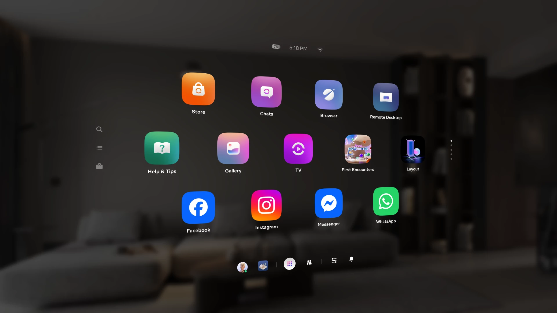
Over the past year, we've been building Navigator — a redesigned interface that brings your apps, people, and system controls together in one place. Since we first introduced Navigator, we've heard your feedback and continued to refine the experience. Navigator is now rolling out to all Meta Quest users.

Navigator is now the default navigation experience, replacing the previous Universal Menu to give you a faster, more streamlined way to access everything on your Quest. 

  • One Unified Interface: Press the Meta button to open Navigator. Your apps, settings, and people are all accessible from one place. 
  • Guided Walkthrough: The first time Navigator appears, an in-headset walkthrough will guide you through the new experience so you can get up to speed quickly.

Thank you to those of you who provided your valuable input as we worked to get Navigator ready for broad rollout. Visit the How to use Navigator on Meta Quest | Quest Help to learn more about Navigator, and let us know what you think in the comments.

    This topic has been closed for replies.

    309 replies

    New Participant
    April 10, 2026

    I thought I installed a Quest 3 update, apparently I installed the firmware for the Playstation Vita on my headset.  This UI is terrible, and honestly feels like a regression in usability. There are many people that have years worth of muscle memory on the old UI, and all of that is now useless as we fumble to figure out a design decision that didn't consider real world usage.  Can you please at least restore the Experimental Features option to revert to the old UI?

    Honored Contributor
    April 10, 2026

    It's not going to happen unfortunately. I've had the new UI since v79 and didn't like it at all but first got used to it and now really like it. You know how you get a completely new UI on your Android or iPhone every few years? It's like that. Confusing at first but then you get to know it and of course it will be tweaked to make it even better over time. Give it time and you will get used to it. It was only during the transition that the old one was available. 

    New Participant
    April 11, 2026

    I've never been a fan of forced updates on hardware that I own, whether it be a phone, a headset, or what have you. That's not because I'm not open to change. I welcome it when it benefits me, or makes my experience better, but this one makes MY personal experience staggeringly worse.

    I understand that their TOS allows them to push any update they want and there's nothing I can really do about it. And though I loathe that practice, it is what it is.

    Still, there's no harm in making my opinion known, even if no-one in a position to do anything about it cares. And my opinion is that this UI was either designed by a serious PS Vita fanboy with a bad sense of humor, or by a very badly prompted and hallucinating AI model. Perhaps both.

    Maybe it's just me getting older, but I'm honestly not sure what was wrong with what we had. I'm just voicing my frustration, as pointless as I realize that is. I'll either get used to it, or I'll stop using it at all, not sure which yet.

    Thanks for listening, at any rate, and sorry for the wall of text!


    Honored Contributor
    April 11, 2026

    No problem Amy_in_space None of us are getting any younger! 😁 Coincidentally I was just looking at an old Samsung phone I kept as a backup that I had completely forgot about. I charged it and switched it on and realized how completely everything had changed from only 4 years ago! Like getting older, UI changes are a fact of life! You are right, there was nothing wrong with the old one, but sometimes background changes to functions can mean having to update the UI. 

    Inspiring
    April 11, 2026

    I like it generally, but I hate how the menu's under the panels no longer disappear in full screen mode, it's spoiled the illusion of having a home cinema sized screen on the wall when watching tv and movies in the browser's full screen mode.  Also in non full screen mode, the white lines that represent where the menus are going to appear, stay visible under panels, and also where floating menus are going to appear when you press the meta button.  Non of these are necessary, and they're really distracting.

    It would be awesome if there were two options in the settings:

    'auto-hide panel options'
    This would be for menus and white lines under windows (full screen and normal mode). When the pointer hasn't been near the window for 3 seconds,  hide white lines/floating window options, and bring the white line back when the pointer is aimed at or near the window.  Then switch from white line to full menu when the pointer is off the window and near the white line.

    'auto-hide main navigator menu'
    This affects the main Floating Navigator Menu (the one that has buttons for library and the time etc, and their minimised white line versions.  When enabled they would disappear after not being pointed at for a few seconds.  And only bring them back when the user clicks the meta button.  The white lines aren't necessary for these main menus, because nobody needs to know that 'this is where your hidden menu is', just bring it back in the centre of the current view when the meta button is pressed.


    Up and Coming
    April 11, 2026

    Provided that they also provide a way to turn off all the Auto-hide stuff.
     I hate Auto-hide in general all it does is add additional Hover time and clicks when they are not needed, there is no benefit to it at all.

    The new White Dot menu and White Line that does nothing, surely the white line could be the list of open apps from the old menu or something else useful.

    The new UI is completely stuffed.
    If you close the last app on the front menu, the menu completely disappears and the only way to get it back is to restart the device to get the menu back.

    New Participant
    April 11, 2026

    How do you revert back to the old one. And if you can’t can you make a setting so we can revert back

    Honored Contributor
    April 11, 2026

    You can't revert back to the old one. Requesting a setting to do so here is pointless as there are only users here. You can contact Meta Support through your Horizon app. 👍 

    Participant
    April 18, 2026

    Merci pour ce commentaire :  

    Inutile de ce fatigué ici 👋

    Honored Contributor
    April 11, 2026

    Got this on both my QPro and Q3 yesterday.  Like any change in UI it takes a bit to get used to it.  So far it seems to work fine and I like it a lot.  Makes me feel like I have an Apple Vison Pro, lol!

    i9 13900K water cooled, RTX4090, Z790 MB w/wifi6e, 64Gb 6400 ram, 2x2TB SSD, 1000W PSU, Win 11, QPro, Q3, w/Link and Air Link, Vive Pro1 with 2x2.0 base stations, Etsy lens mod and Index Controllers
    Honored Contributor
    April 11, 2026

    Shhhhhhhhh! Don't say that Tom, they might send you a bill for $3,500!😂 

    adamwhite81
    New Participant
    April 11, 2026

    Mixed Reality Link found for upcoming quest 4 ui showcased 

    This link directs to a shared post on the X platform, specifically hosted under the Grok section, which may contain user-generated content, media, or discussions relevant to the topic or community associated with Grok.

    Montago
    Participant
    April 12, 2026

    I've been using the new interface for a couple of days now and it feels a bit frustrating to use:

    When inside a game and you need to change boundary settings, you need to press meta button to get out, then one more time to bring up the app library to find the settings button - then open settings and change stuff ... But in order to come back to the game 🙈 ... theres no easy way that i have found, so ill be pressing the meta button several times where the interface is very confused what my intentions are.... 

    How the hell was this ever approved ? 

    Two layers of interface just makes everything worse. 

    Why not fully implement the interface in the Hexagon environment, eg with Tabs or pages or whatever makes sense ? 

    At the current state i would prefer to roll back to the previous menu system. 

    Participant
    April 14, 2026

    Right?!

    New Participant
    April 12, 2026

    Well I hate it! Several options are simply gone. It's more complicated and horrible. Good job. No way to hide uninstalled apps. No, don't tell me to hover and click on the three dots. They don't exist! Clutter clutter.... 

    Choleni
    Honored Contributor
    April 12, 2026

    JJW55​  

    JJW55 wrote:

    No way to hide uninstalled apps.

    Press and hold the trigger of your controller over the app you want to hide..... a menu will pop up, here you'll find "hide".

    If you need some tips, here is a thread that includes a link to a video on how to use the navigator.

    Tips on using the new UI | Meta Community Forums - 1371980

    New Participant
    April 12, 2026

    New navigator..... Garbage! No way to hide uninstalled apps/games, it's all clumped together. No, don't tell me to hover and click on the three dots. They don't exist!! I choose to show only installed and three uninstalled apps are still there. Clutter!!! Fix it!

    New Participant
    April 12, 2026

    Never got a walkthrough - it just HALF appeared in front of the old menu grid.  Took me 5 minutes to start a game a friend was waiting for me for.  And we usually start a headset call on games that are single player so we can stay with each other through our progress.  S0 - GET THAT **bleep** GREEN HEADSET ICON OUT of my VIEW!!!!!!!!