

MetaStoreHelp
Community Manager
April 7, 2026

Navigator Now Rolling Out to All Quest Users
  • April 7, 2026
  • 309 replies
  • 13718 views

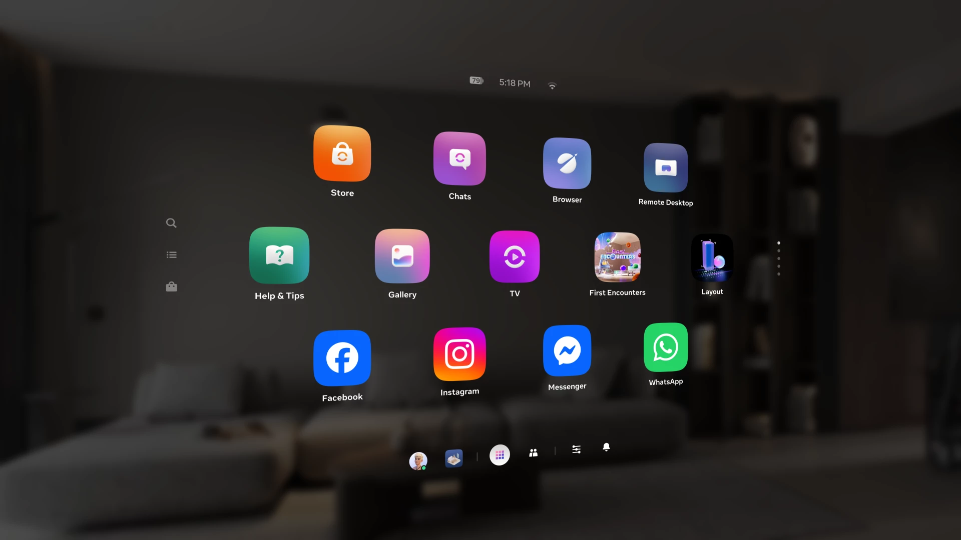
Over the past year, we've been building Navigator — a redesigned interface that brings your apps, people, and system controls together in one place. Since we first introduced Navigator, we've heard your feedback and continued to refine the experience. Navigator is now rolling out to all Meta Quest users.

Navigator is now the default navigation experience, replacing the previous Universal Menu to give you a faster, more streamlined way to access everything on your Quest. 

  • One Unified Interface: Press the Meta button to open Navigator. Your apps, settings, and people are all accessible from one place. 
  • Guided Walkthrough: The first time Navigator appears, an in-headset walkthrough will guide you through the new experience so you can get up to speed quickly.

Thank you to those of you who provided your valuable input as we worked to get Navigator ready for broad rollout. Visit the How to use Navigator on Meta Quest | Quest Help to learn more about Navigator, and let us know what you think in the comments.

    This topic has been closed for replies.

    309 replies

    New Participant
    April 9, 2026

    Please revert this garbage.

    New Participant
    April 9, 2026

    Loved turning on the headset before, not so much now. Different, yes, better, no.

    New Participant
    April 9, 2026

    Meta's biggest blunder its cheap feels like a Chinese knockoff of android its in your face it has limited its capabilities with the new UI the previous UI was lightyears ahead of this crap meta should be embarrassed to say its better when you cant even have an ap lay open in the background you have to leave your game then NAVIGATE to the library to open an app thats already open when before you could push the meta button to bring up the task bar and their it was right there and the task bar i do t need a dedicated button to open my profile the most useless feature on meta and it realy isnt a priority task bar feature the pass throughout button is now a drop menu for some reason so istead of havi g to just click and its done i now need to click and open the selection box as they have now moved the dedicated pass through button in the quick menu makes no sence especially now that any time i want to open up what would normally be pinned to task bar as my quick apps or commonly used app i have to now i have to minimise evrything and then navagate to what i can describe as a home screen to reopen somthing to minimise it to use another screen this has limited what people can multi task with this is a  disaster if your goal is to push customers away you sure are doing it well as i wouldnt recommend this to any1 now if you want customers to be able to use it off the rip its not intuitive at all its the complete opposite 


    Please give users an option to revert the UI 

    New Participant
    April 12, 2026

    I'm pretty sure I agree with your take on this.. I just need to tell you that you should really invest in punctuation. 

    New Participant
    April 10, 2026

    I was using the quest 3 at my local real library - now previously i had no problems using the headset in this location as the old UI display windows the icons are well contrasted against a black virtual screen background.

    But in the well lit library with windows and the new UI i found that the floating icons especially the smaller ones when surrounded by the washed out glairy passthrough display they become nearly invisible against the background.

    This problem never happened with the old display you always got good contrast easy to read - the new UI seems intended to violate Human Factors Engineering principles.

    Up and Coming
    April 10, 2026

    Just like Windows 11’s crappy right-click menu.

    Honored Contributor
    April 10, 2026

    Really? I was using it yesterday and I didn't have to click more times than on the old one at least on my usual stuff. Maybe I missed something. What specifically did you have to click more times on? I'm curious now. 👍 

    Up and Coming
    April 11, 2026

    To open recent apps you now have to hover over/click the White Dot Button wait for it to unhide, click the  Meta Button, then click on your recent app. On the old menu you could just directly click on the recent app. Similarly with pinned apps.
    Same sort of thing to close windowed apps, you now have to Hover/Click on the white line and then click on the cross to close the app (provided that it doesn't autohide again forcing you to start again), whereas with the old menu you could just click on the cross.
    I took 5 attempts to close a windowed app today because the annoying auto-hide kept reverting to a white line, it's f'n annoying!!!!!!!

    steve40
    Honored Contributor
    April 14, 2026

    To open recent apps you now have to hover over/click the White Dot Button wait for it to unhide

    You can simply press the Meta button on the controller once. That will also open Navigator.

    I took 5 attempts to close a windowed app today because the annoying auto-hide kept reverting to a white line, it's f'n annoying!!!!!!!

    Hmm, you must have really shaky hands or really bad controller tracking or something. I'm having no trouble at all closing windows. But it does raise the point that being able to turn off autohide could be an important accessibility issue.

    I think Meta is doing some sort of A/B testing, and some people seem to have a slightly different Navigator configuration than others. Not everyone has the "hide windows" icon, for example.

    Up and Coming
    April 10, 2026

    After a forced update yesterday, my Quest 3 firmware is now V2.1 with the new popular UI.
    But I can't move the white bar, the bar with a little white dot on the left.
    Normally when I point to the white dot, it should change to META logo but not.
    It's really annoying every new update with new bug.
    I have already done everything include Software Update Tool.
    The last chance is to reset it, but I really hate to reset my headset.

    New Participant
    April 10, 2026

    The new user interface (Navigator) is counter-intuitive and hinders my experience. I am very dissatisfied with the removal of the toggle to switch back to the Classic UI/ "Universal Menu". Please provide an official way to opt-out of this new layout or bring back the toggle in Experimental Settings. Forced UI changes without a roll-back option are making the device harder to use.

    Up and Coming
    April 10, 2026

    Sorry it's not going to change or go back get use to it it's the future.

    nalex66
    Honored Contributor
    April 10, 2026

    Navigator bug: every time I exit AirLink, the top bar of the UI (battery, clock, WiFi) is missing, and I have to restart the headset to get it back.

    Otherwise, I like the new interface (they fixed the missing sort/filters issue in the Library from the v83 Navigator).

    DK2, CV1, Go, Quest, Quest 2, Quest 3. Try my game: Cyclops Island Demo
    New Participant
    April 10, 2026

    This UI is extremely difficult to navigate, the quick settings tab cannot be used in parallel with other apps, library have too big icons and the whole UI is chase after vision pro and it's awful. I prefer the old one even tho it was super simple. Also this glitches so much that it's too much bother 

    New Participant
    April 10, 2026

    i hate you, meta. you ruined my experience on my headset. i've been a user for over a few years now and since this "great update" came out i've been actually been so confused. i stopped using my headset now. why did this get changed? no one had a problem with the old menu..

    Honored Contributor
    April 10, 2026

    acjustin Dear friend, don't become despondent. I have been using the new UI since v79. Honestly I did not like it at all at first but over time, I've not just gotten used to it, now I actually like it. It does take a little bit of getting used to it, but it won't be long before you'll feel it's fine. Give it time. 🙂 Like everything new there is a period of adjustment.