

MetaStoreHelp
Community Manager
April 7, 2026

Navigator Now Rolling Out to All Quest Users
  • April 7, 2026
  • 309 replies
  • 13720 views

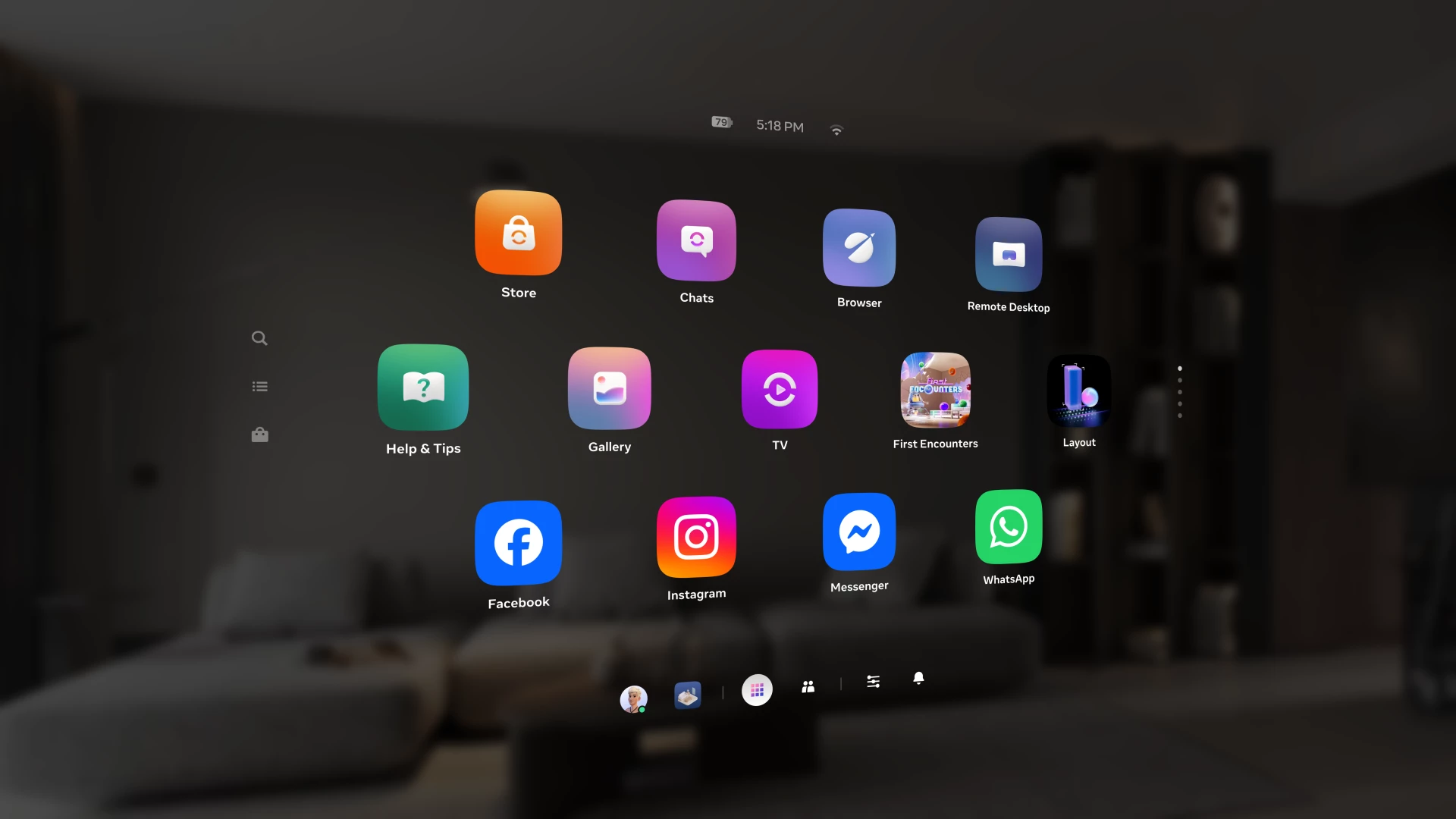
Over the past year, we've been building Navigator — a redesigned interface that brings your apps, people, and system controls together in one place. Since we first introduced Navigator, we've heard your feedback and continued to refine the experience. Navigator is now rolling out to all Meta Quest users.

Navigator is now the default navigation experience, replacing the previous Universal Menu to give you a faster, more streamlined way to access everything on your Quest. 

  • One Unified Interface: Press the Meta button to open Navigator. Your apps, settings, and people are all accessible from one place. 
  • Guided Walkthrough: The first time Navigator appears, an in-headset walkthrough will guide you through the new experience so you can get up to speed quickly.

Thank you to those of you who provided your valuable input as we worked to get Navigator ready for broad rollout. Visit the How to use Navigator on Meta Quest | Quest Help to learn more about Navigator, and let us know what you think in the comments.

    This topic has been closed for replies.

    309 replies

    Participant
    April 13, 2026

    You put back when the old interface has all waiting !. Time is long !

    Honored Contributor
    April 14, 2026

    I'm not sure what your trying to say, maybe you're using a translator that isn't so good. But please stop writing multiple comments on the same subject with one sentence on each comment. Put all your thoughts together into one comment. Multiple comments like this can be flagged as spamming and you could get banned. 

    Participant
    April 13, 2026

    the old interface expected everyone. When is it?

    Honored Contributor
    April 14, 2026

    What are you trying to say? 

    Participant
    April 18, 2026

    Il est inutile de ne pas comprendre ce que l'on vous demande !

    La nouvelle interface est très mauvaise !

    (Je) et (Nous) voulons retrouver l'interface précédente qui était très bien.

    Point final

    Ne faites pas semblant de ne pas comprendre.

    Faites une mise à jour proposant le choix entre les deux interfaces que l'on puisse choisir celle qui nous convient.

    Pourquoi devons-nous répéter nos arguments ?

    Parce que dans la finalité vous n'en avez rien à faire vous faites ce que vous voulez !


    En français c'est peut-être plus clair.

    New Participant
    April 13, 2026

    Please bring back the old UI the new one is not good at all
    - Dark Theme : Hate that, I deactivate it everywhere I can, first time I can't...
    - So many click to do the same as before
    - Always have to use the Meta button
    - Can't resize or move library windows
    - First time I have to look Youtube video to understand you're UI Now I know how it work and still NOT like it
    - Why Put together near everything in one menu. I always search thing.

    Look like we have downgrade our MetaQuest

    Participant
    April 14, 2026

    EXACTLY!

    New Participant
    April 14, 2026

    The new UI has broken Virtual Desktop. Anytime I pause any PCVR game, my guardian resets so that I'm half my height from the floor. I then have to go back into the Navigator and reset the guardian. Every single time. The new UI is buggy and just freezes sometimes.

    Honored Contributor
    April 14, 2026

    meanbrew​ I haven't seen this issue with my Q3 using VD.  I flew a lot today with msfs 2024 and paused a number of times, and this did not change my guardian boundary or height.  Likewise, this also doesn't happen with Link or Air Link. 

    Maybe try going to the VD discord and see if any users can give you a fix.  Insufficient room lighting and/or interference from nearby BT devices can sometimes cause this.  Good luck mate and cheers.

    i9 13900K water cooled, RTX4090, Z790 MB w/wifi6e, 64Gb 6400 ram, 2x2TB SSD, 1000W PSU, Win 11, QPro, Q3, w/Link and Air Link, Vive Pro1 with 2x2.0 base stations, Etsy lens mod and Index Controllers
    steve40
    Honored Contributor
    April 14, 2026

    It's impressive how confidently you talk down to people while contributing absolutely nothing yourself. If condescension were a skill, you'd finally have one 😆.

    Honored Contributor
    April 14, 2026

    You seem to have made an assumption that is popular amongst certain self congratulatory people. When you mentioned "education" in your grammatically incorrect sentence, you are assuming that a certain level of education automatically equates to an equal level of intelligence. Having interviewed many educated people for my design engineering consultancy business over the years, I can assure you that education doesn't make you smarter. What category you are in I can only guess.  

    Participant
    April 14, 2026

    this was so unnecessary - it's just window dressing when more important issues were at stake.
    Plus you can't use it in the dark- or sigh, it's just not worth commenting on.

    New Participant
    April 14, 2026

    I actually like the new navigator! Just a couple tips tho that could make it loads better 

    • I would add a slider for how dim you want the room to be when you opened the navigator. I feel like everything going dark is a little jarring and it ruins the point of pass through for me, passhthrough is one of my favorite ways to scroll menus! But now, if I have the main navigator open, it just feels dull. This could even go with the brightness sliders or environment or it could be an option on the navigator itself

    • I also suggest having some of the Meta apps being on the right side as a side bar, you guys kinda did that with quick settings, but I’d like Chat settings stuff like that on the right side as gray icons. I don’t have the headset on, so I don’t know what’s already on there, and maybe I haven’t gotten used to it 100% yet but I feel like to just message a friend in VR. It takes a couple extra clicks.

    • lastly, i’m missing the sort by recents option. It’s been a little annoying trying to scroll to Find My apps but considering I mainly play battle talent, I don’t have to scroll very far. XD

    • overall I really do like the new navigator. It just feels more fun and unique, but there are definitely ways that it can be improved, and considering how many updates you did to the old UI, feel like this one can become really good with a little bit of tweaking!

    • Last last one! I think you should be able to toggle to the old UI if you want! I know a lot of people preferred the old UI and you don’t have to constantly update the old UI because I know you wanna focus on a new one but just have an option in appearance where you can turn it on and it will just load the old UI.


    Thanks!

    avengedsevenfoldfan1007
    New Participant
    April 14, 2026

    Most annoying ui I’ve ever had to navigate 

    April 15, 2026

    MetaStoreHelp​ I’ve sent you a direct message, can you please check it?